Mastering Responsive Design: A Complete Guide for Building Flexible and Mobile-Friendly Websites

What Is Responsive Design?
Responsive design is a web development approach that ensures a website automatically adjusts its layout, images, and functionality based on the size of the user’s screen. Whether someone is viewing your website on a large desktop monitor or a small smartphone, a responsive website adapts to fit, giving the user the best possible experience. No pinching, zooming, or sideways scrolling—just seamless usability.

Which of the Following Best Defines Responsive Design?
Imagine you’re pouring water into different containers—no matter the shape or size of the container, the water adapts to fit. That’s exactly what responsive design does for your website! It “responds” to the device it’s being viewed on, adjusting elements like images, text, and layout to offer a perfect fit, regardless of the screen size.
Mobile Responsive Design: Why It Matters
If your website isn’t mobile responsive, you’re probably losing potential customers. A mobile responsive design ensures that your site looks great and functions smoothly on any mobile device. It’s more than just resizing images—it’s about reorganizing and rethinking the layout for smaller screens to keep the user experience intact.
Responsive Design Website: The Need for Flexibility
A responsive design website is built with flexibility in mind. It uses fluid grids, flexible images, and media queries (CSS) to automatically adapt to any screen size. By doing this, the website provides a consistent user experience whether you’re on a phone, tablet, or desktop.

Screen Sizes for Responsive Design: What You Need to Know
When designing a responsive website, you need to think about screen sizes. Modern devices come in all shapes and sizes, so designing for one or two screen sizes is no longer practical. Popular breakpoints for responsive design include:
- -Small devices (smartphones): 320px–480px
- -Medium devices (tablets): 481px–768px
- -Large devices (desktops/laptops): 769px and above
Responsive Design Definition: Simplifying Web Experiences
To put it simply, responsive design is the practice of designing websites that work on any screen size or device. By using fluid grids, flexible images, and media queries, you ensure that the layout and functionality of a website adjust depending on the user’s device.
If a Website Is Designed With a Responsive Design, Then….
If a website is designed with responsive design in mind, it will look good and work well on any device—big or small. No more pinching, zooming, or clunky navigation on smartphones or tablets. It’s an approach that prioritizes user experience across the board.

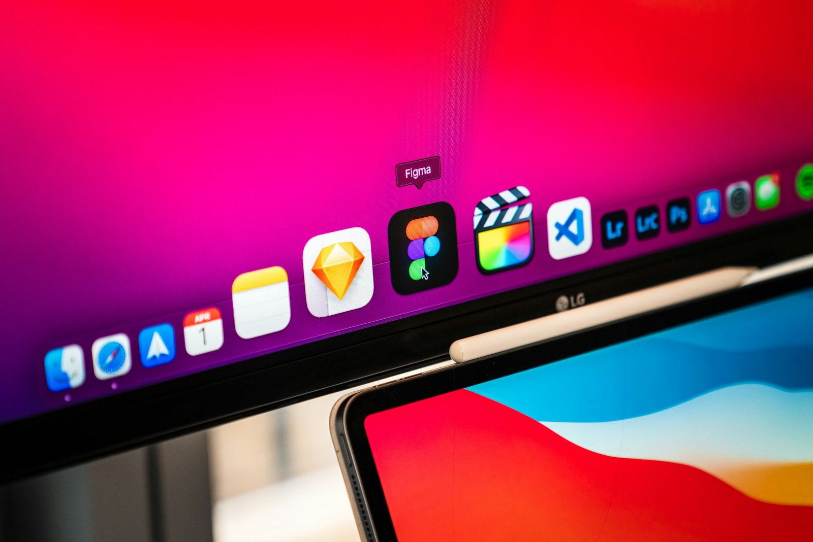
Figma Responsive Design: Designing for All Screens
Tools like Figma have made it easier than ever to create responsive designs. With features that allow you to design layouts for multiple screen sizes, you can preview how your design will look across various devices before even coding it. It’s an essential tool for any web designer who values responsive design.
Responsive Design Checker: Test Before You Launch
Before you launch a website, it’s crucial to test how it looks across different devices. Using a responsive design checker lets you see how your site performs on a range of screen sizes, ensuring everything works perfectly before going live. This will save you from the embarrassment of a broken mobile layout or poorly resized images.
Web Responsive Design: A Universal Approach
At its core, web responsive design is about creating a universal user experience. A site that adjusts gracefully from a wide desktop to a small smartphone ensures that users don’t lose functionality or accessibility just because they’re on a different device.

Breakpoints for Responsive Design: Defining Your Flexibility
In web design, breakpoints are specific screen widths where the design of a site changes. Common breakpoints for responsive design are at 320px, 768px, and 1024px, though these can vary depending on the project. By using these breakpoints, you ensure that your website shifts and adjusts as needed, providing the best user experience at each size.
Adaptive vs Responsive Design: What’s the Difference?
While responsive design automatically adjusts the layout depending on screen size, adaptive design focuses on creating specific layouts for different devices. In an adaptive design, you might have one version of the website for mobile, one for tablet, and one for desktop. With responsive design, you create one flexible layout that adapts to any screen size.

Responsive Design Example: Putting Theory into Practice
An excellent responsive design example is Apple’s website. No matter what device you view it on, the layout adjusts perfectly to provide an optimal user experience. The images resize, the text adjusts, and the entire structure reflows seamlessly.
What Does Responsive Design Mean for Your Website?
If you want your website to reach as many users as possible, responsive design is the way forward. It ensures that no matter where your audience comes from—mobile, tablet, or desktop—they’ll have a great experience.

Responsive Design Agentur: Why Hire a Pro?
If all of this sounds a bit overwhelming, hiring a responsive design agentur (agency) can be a game-changer. They’ll have the expertise to ensure your site works seamlessly across all devices, saving you time and energy.
Responsive Design vs Adaptive Design: Which One Should You Choose?
The responsive design vs adaptive design debate comes down to flexibility. While adaptive design can be useful for sites with very different mobile and desktop needs, responsive design offers a simpler and more cost-effective approach. For most websites, responsive design is the way to go as shown by MDN

Responsive Design Testing: Ensuring Perfection
Once your responsive site is ready, the next step is responsive design testing. You need to test it across multiple devices and screen sizes to ensure everything works as expected. Responsive design checkers and physical device testing are both key to a smooth launch.
Conclusion
In today’s digital world, having a responsive website is no longer optional—it’s a must. From improving user experience to boosting SEO, responsive design ensures that your website is accessible and functional across all devices. It’s the most efficient way to provide a seamless experience to your users, presented to you by Nexaphaze no matter where they come from. So, whether you’re designing your own site or hiring a responsive design agency, make sure your website is ready for the modern web.
What is the difference between adaptive and responsive design?
Adaptive design creates different layouts for various screen sizes, while responsive design uses one flexible layout that adapts to any screen size.
How do I test my responsive design?
You can use a responsive design checker or physically test your site on various devices to ensure it adapts to different screen sizes.
Why is responsive design important for SEO?
Responsive design improves user experience, decreases bounce rates, and increases the time spent on a site, all of which are key factors in boosting SEO rankings.
What are the common breakpoints for responsive design?
The common breakpoints for responsive design are 320px, 768px, and 1024px, though they can vary depending on the project.
Can I create responsive designs in Figma?
Yes, Figma has powerful tools that allow you to design and preview responsive layouts across various screen sizes, making it easier to visualize and implement responsive design.

As a UK-based digital expert, we partner with innovative startups, B2B trailblazers, and fintech disruptors to craft bespoke online experiences that drive real results. We deliver high-performing websites that elevate your brand and accelerate your growth.
Contact Us
+44 7359 497 513
hello@nexaphaze.com
Flat 15, Chancery House, Lowood Street, London, England, E1 0BU

